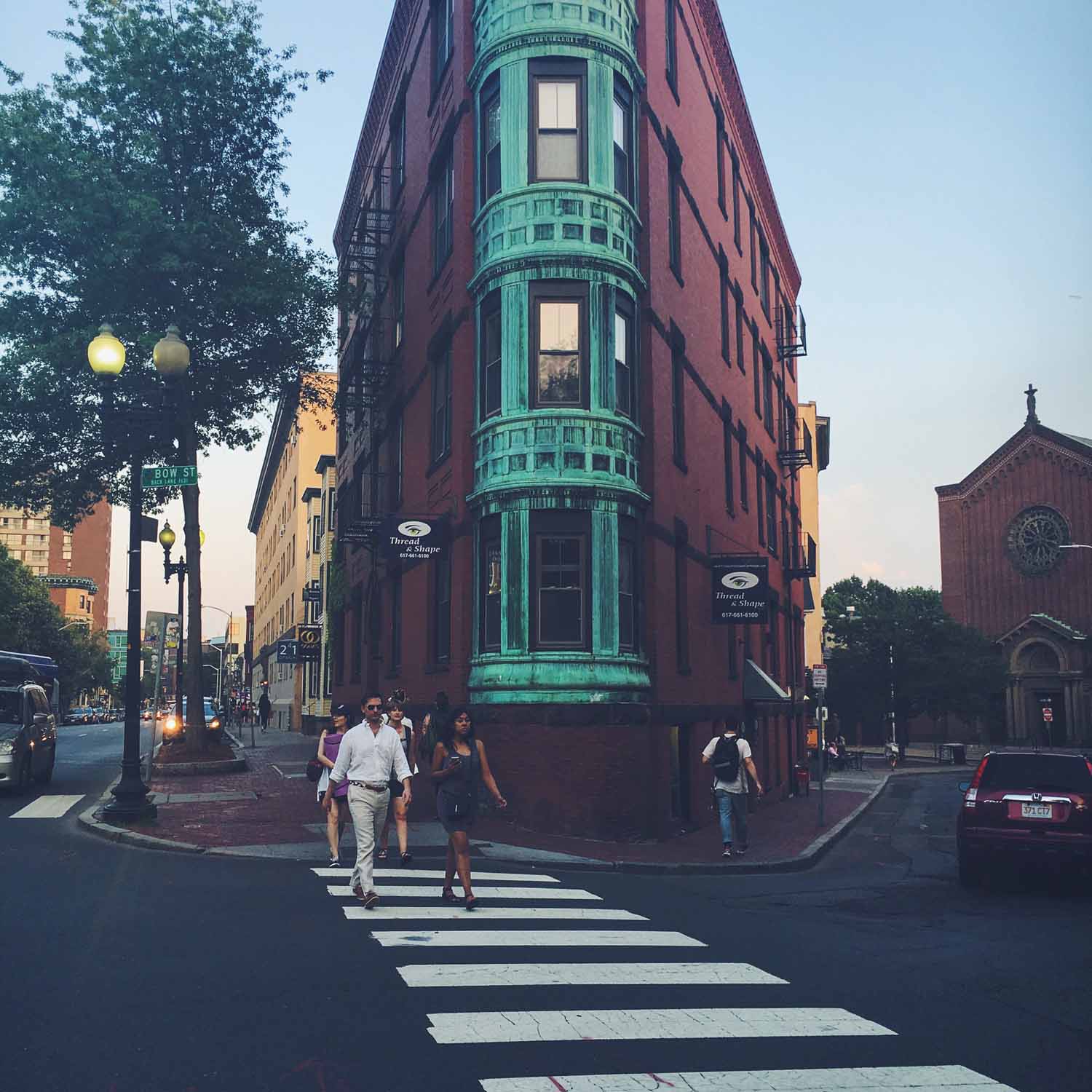
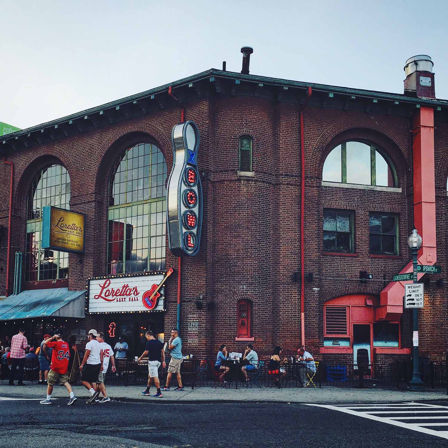
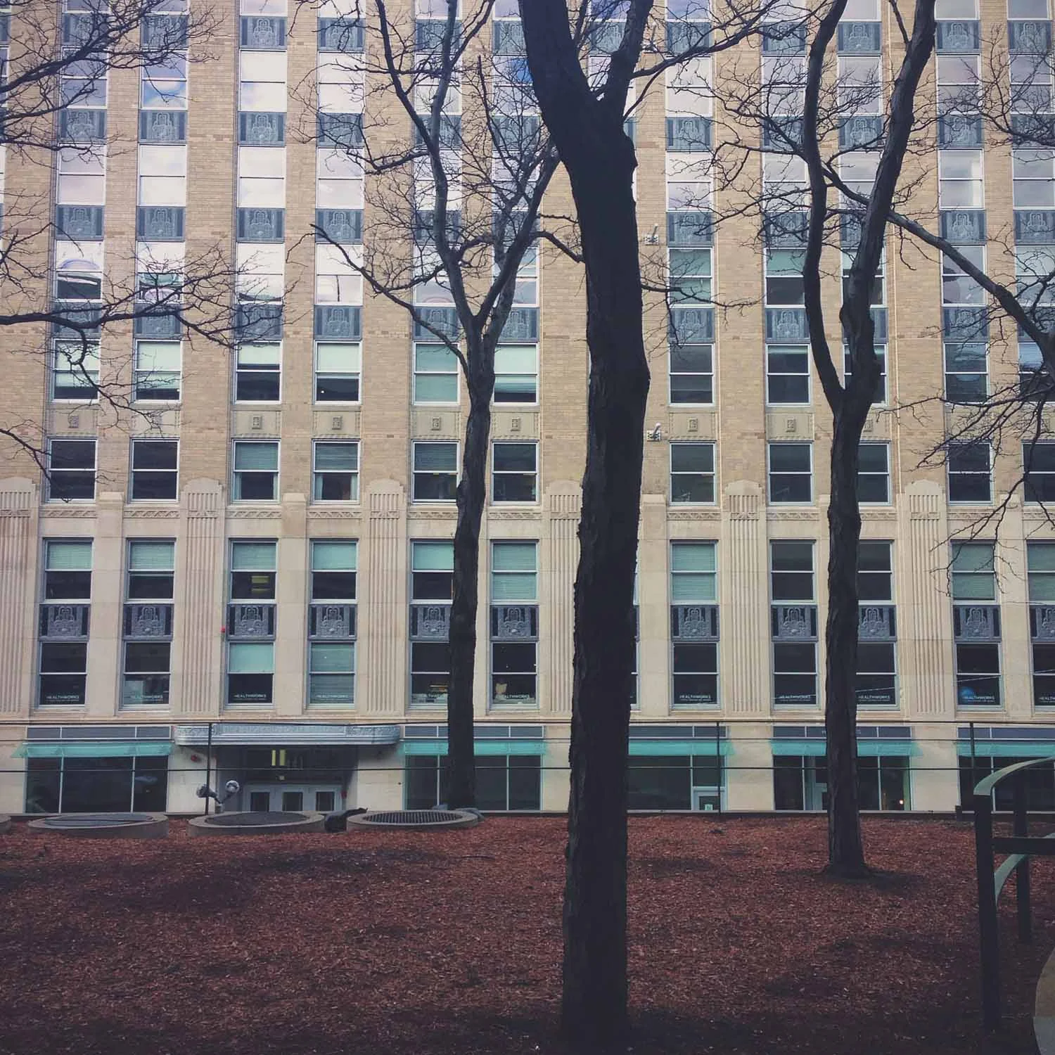
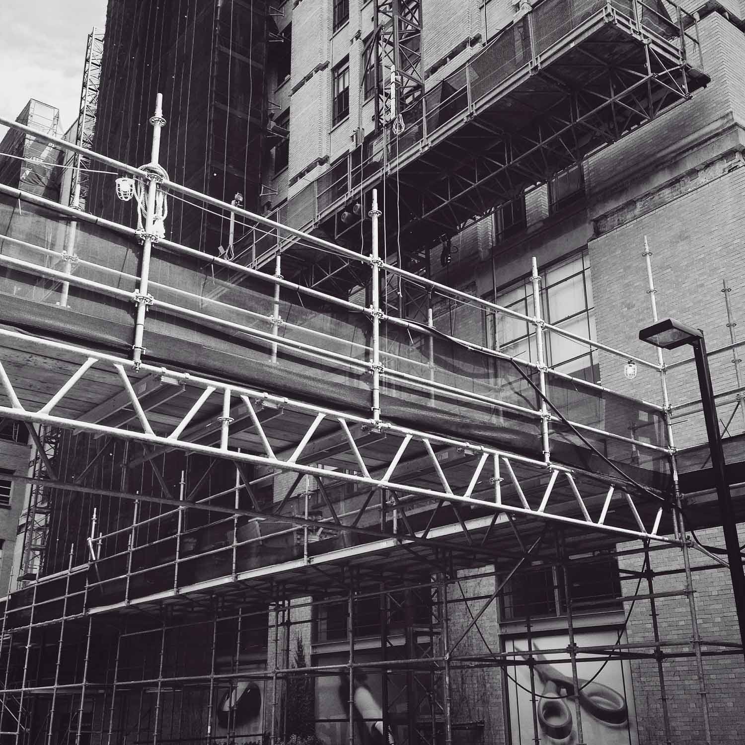
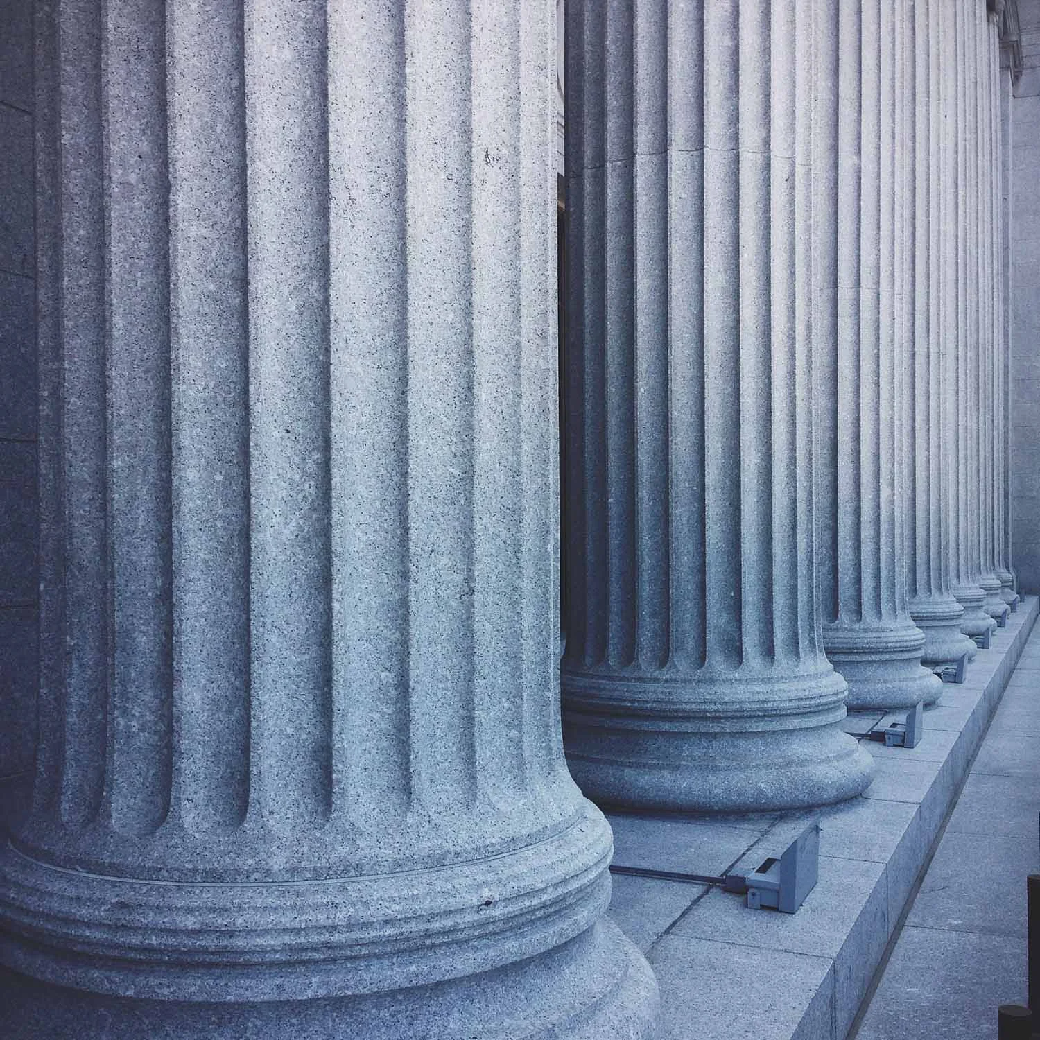
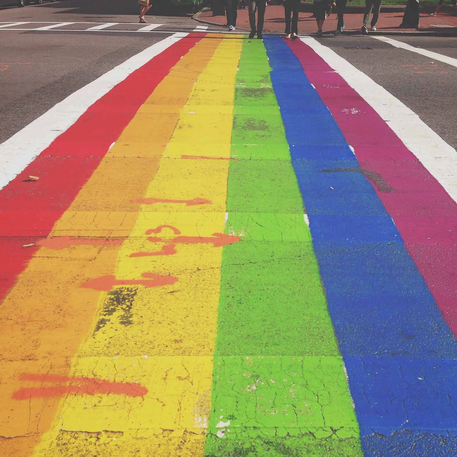
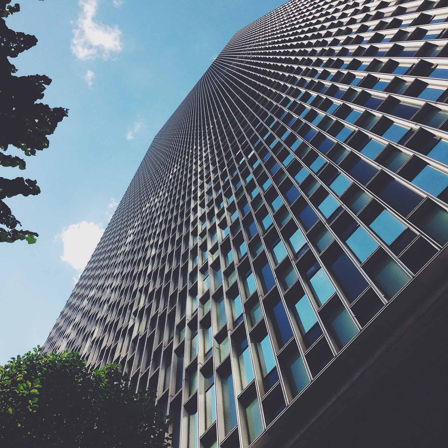
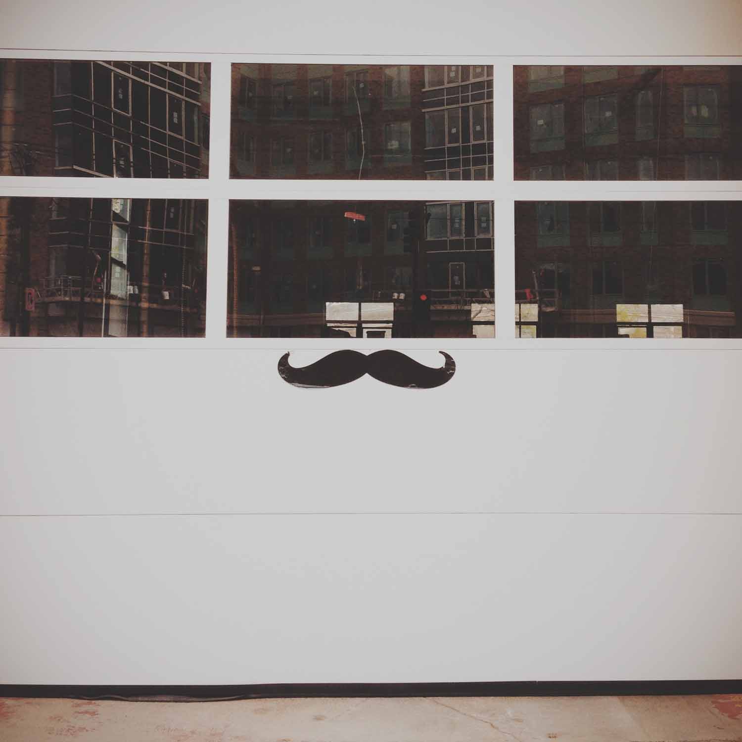
This theme took me back to some of my favorite subjects: street scenes and urban landscapes around Boston, full of people and architecture. The idea started with a great pub we saw in Australia. It was one of many, and while it was very British/Australian, it also reminded me of Boston a bit. When I was looking for a new theme, I thought of focusing just on interesting corners or intersections.
Boston has such a variety of architecture that I thought it would be a good subject with a lot of different looks, not just the same thing over and over. Halfway through, I remembered the food court in Downtown Crossing called "the corner" and it was all downhill from there! This theme was also fun because it got me back out and exploring, making good use of my summer Friday work hours. I went to a few neighborhoods I don't get to much anymore and came away with some great photos.
Beauty on the outside
This theme was about facades of buildings and the outward appearance they project. I love photographing architecture, so to make this more of a challenge, I decided to limit myself to just the front. Not geometric details, or shots looking up, but just the view from the sidewalk. Boston actually has a lot of different architectural styles from neighborhood to neighborhood, so it wasn't too hard to find a good variety.
These photos are from the Back Bay, South End, Fenway district and Kenmore. As usual, half the places were ones I had in mind, and the others were ones I stumbled upon along the way. There obviously was no shortage of subject matter, so these nine are a very select edit of what I shot.
Walk the line
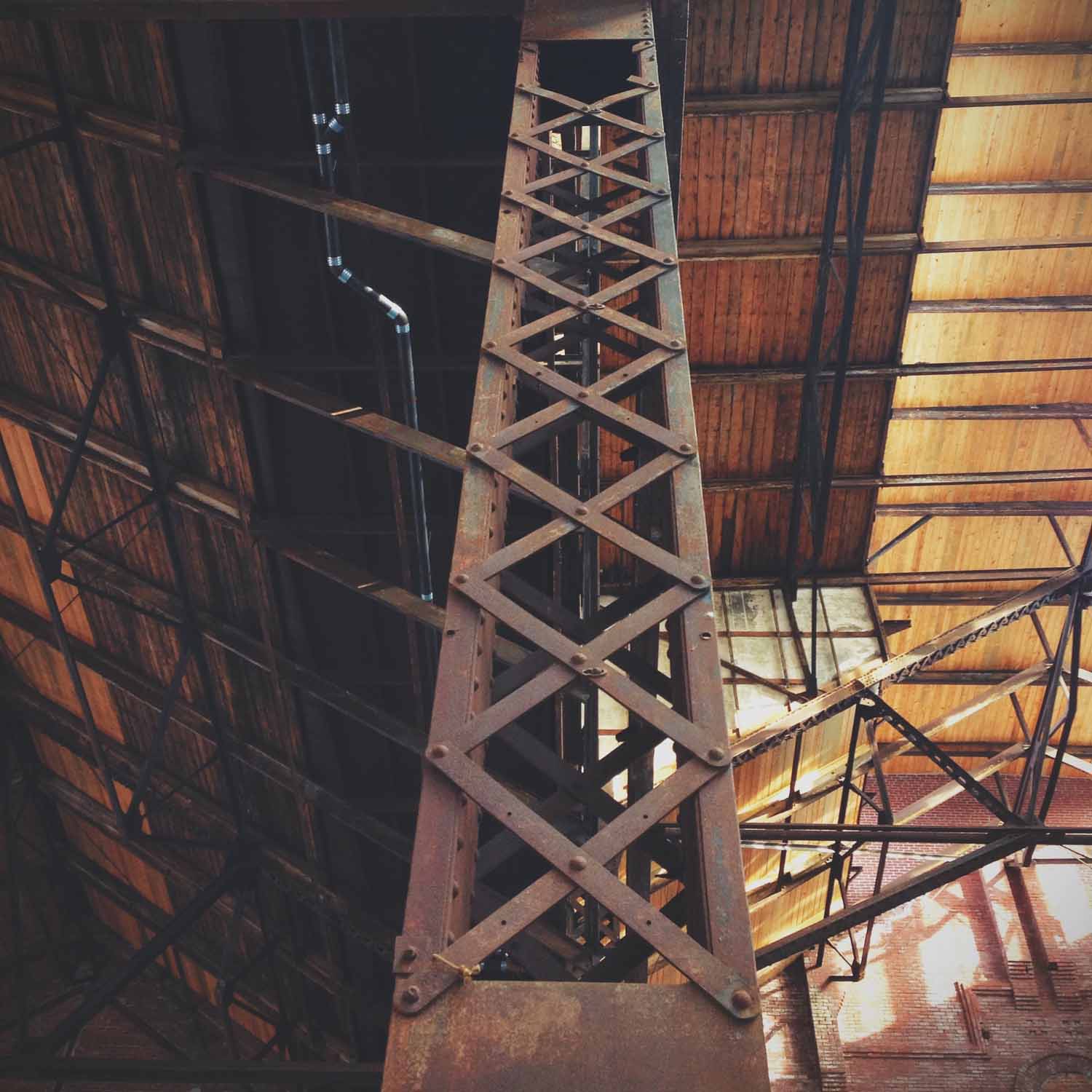
I love lines. They're strong parts of architecture, urban landscapes, industrial facades, shadows, pretty much everything I like to photograph. That's why I thought this would be an easy theme. But it's the same reason it turned out to be somewhat difficult. I've already photographed a LOT of lines for this theme project. I would come across some great subject matter, but then realize I had a similar picture already up on Instagram. Part of this year-long challenge is to produce new work, so I tried not to repeat myself too much.
Still, I enjoyed working on this theme a lot. I originally thought of it for two reasons. The first is Instagram itself. They host a weekly themed challenge, called the Weekend Hashtag Project. I don't ever really participate in them because I keep myself focused on my own chosen themes and save my Instagram feed for just those photos. A recent Hashtag Project was all about lines, specifically ones that lead to a corner of the photo frame. I saw some really great work and was inspired to post my own photos, even if a few weeks later.
My second reason is that I love the work of Charles Sheeler. He's been one of my favorite photographers ever since I became aware of him through photo class in high school. He took great industrial and urban photographs in the 1920s and 30s, before such subject matter was really accepted as art, and strong lines are the foundation of his compositions. One of the photos I took early on for this theme is something of a modern echo of his great photo titled "Criss-Crossed Conveyors," pictured left. I didn't notice the resemblance until I decided to make my image grayscale. I guess his influence is stronger than I thought.
Split screen
This theme was about symmetry, and I was surprised that it was much harder than expected. It was influenced by Wes Anderson and his style of cinematography, which I love. Around the time his most recent movie, The Grand Budapest Hotel, was released, a video compilation of his movie scenes was posted online. It shows Anderson's obsession with, and mastery of, symmetry in his shots. It's mesmerizing to watch and impressive that he creates it so consistently, especially since as the viewer, it doesn't seem to be obvious or oppressive. I myself didn't notice how prevalent it was before watching that clip, and I've seen all these movies multiple times.
So I thought this wouldn't be that difficult. Sure, symmetry is everywhere, but I quickly found this theme was becoming an excuse for me to just take more pictures of architecture. I tried to switch to objects, but found that a lot of compositions and the resulting images weren't visually interesting to me. Even with editing and filters, they just looked flat. The genius of Wes Anderson's compositions is that they appear simplistic, but are carefully crafted of many components and layers. It's something I realized has to be created for the most part, rather than stumbled across while I'm out searching for photos. I also realized I like taking photos that are often not symmetrical, with something askew or at an angle, or lines that criss-cross the frame. Surprising, since I love Wes Anderson's visuals so much.
It took me a long time to choose these final nine. While many are still architecture-related, I did begin to find more interesting objects and subjects than just classical columns and the geometric facades I started with. I ended up choosing a group of images that created a variety of colors, subjects and types of symmetry. Though the photo with the columns and arches reflected in the water is still my favorite. *sigh*
Pattern play
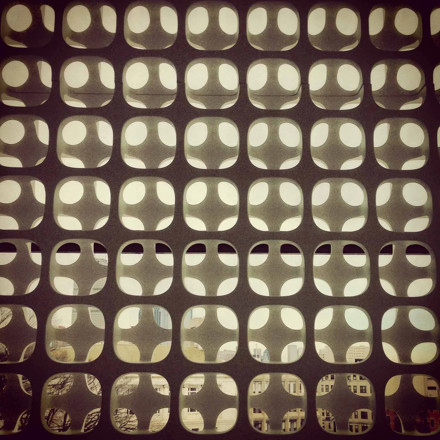
This theme was to focus on patterns, which I thought would be fairly easy. While there are lots of patterns in everyday things, a lot of them start to look the same and are mostly geometric. They also didn't always lend themselves to especially interesting photos, in terms of composition. You can only take so many photos with the camera aimed straight at a pattern.
But after reviewing the bunch, I think they're a good variety of patterns, color and compositions. It took almost the whole two weeks to find all nine, and most ended up being from my own neighborhood in the South End. Its bricks, old grates and industrial buildings were the best subjects for natural patterns, especially since Boston isn't bursting with striking modern architecture. Enjoy!
