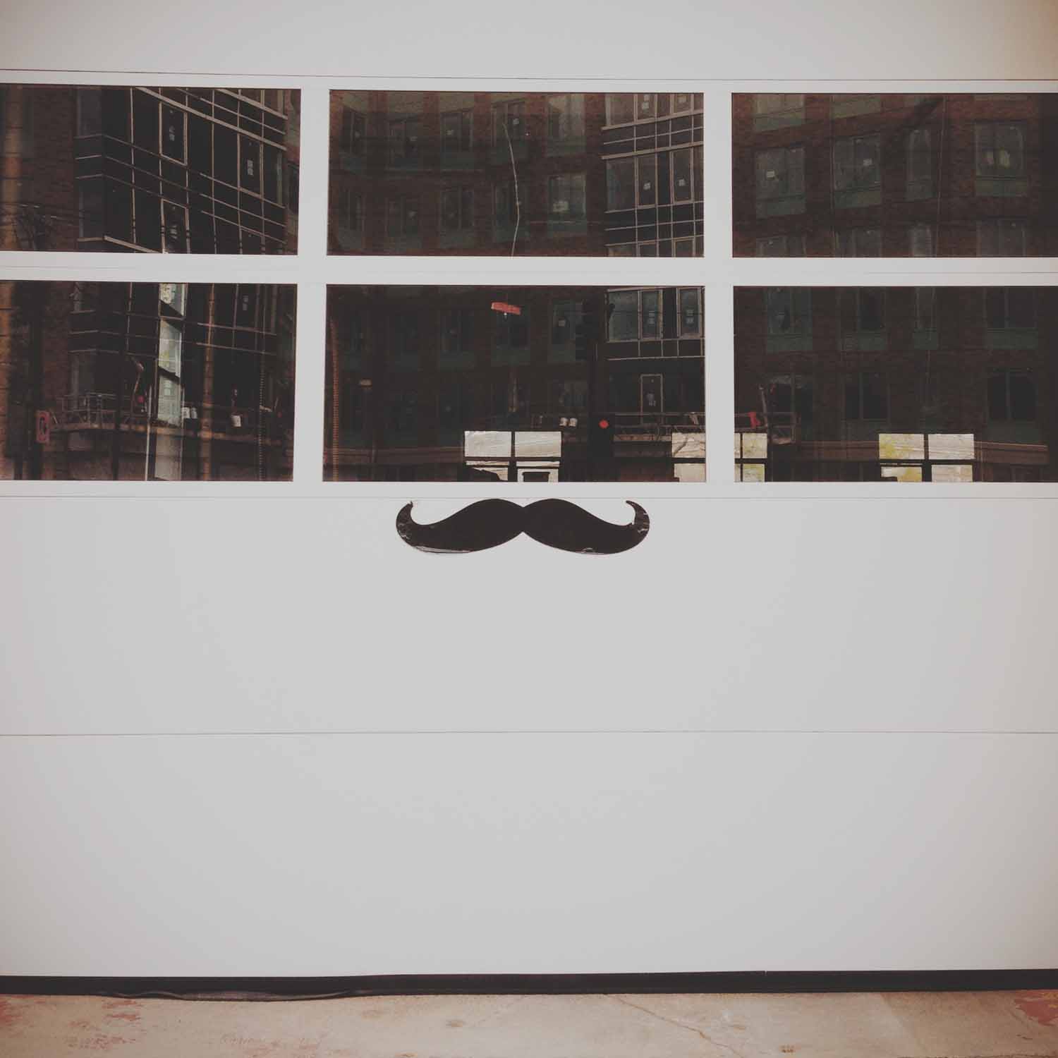
This theme was about symmetry, and I was surprised that it was much harder than expected. It was influenced by Wes Anderson and his style of cinematography, which I love. Around the time his most recent movie, The Grand Budapest Hotel, was released, a video compilation of his movie scenes was posted online. It shows Anderson's obsession with, and mastery of, symmetry in his shots. It's mesmerizing to watch and impressive that he creates it so consistently, especially since as the viewer, it doesn't seem to be obvious or oppressive. I myself didn't notice how prevalent it was before watching that clip, and I've seen all these movies multiple times.
So I thought this wouldn't be that difficult. Sure, symmetry is everywhere, but I quickly found this theme was becoming an excuse for me to just take more pictures of architecture. I tried to switch to objects, but found that a lot of compositions and the resulting images weren't visually interesting to me. Even with editing and filters, they just looked flat. The genius of Wes Anderson's compositions is that they appear simplistic, but are carefully crafted of many components and layers. It's something I realized has to be created for the most part, rather than stumbled across while I'm out searching for photos. I also realized I like taking photos that are often not symmetrical, with something askew or at an angle, or lines that criss-cross the frame. Surprising, since I love Wes Anderson's visuals so much.
It took me a long time to choose these final nine. While many are still architecture-related, I did begin to find more interesting objects and subjects than just classical columns and the geometric facades I started with. I ended up choosing a group of images that created a variety of colors, subjects and types of symmetry. Though the photo with the columns and arches reflected in the water is still my favorite. *sigh*


